Want to Create a More Engaging Learning Experience? Think Responsive.
Let me start by sharing three seemingly unrelated stats with you:
- According to Google, we use an average of three different screen combinations each day (smartphone and laptop, smartphone and tv, tv and tablet).
- According to Bersin by Deloitte, the Modern Learner has 1% of a typical workweek to focus on training and development. Assuming a 40-hour workweek, this amounts to just under five minutes each day.
- According to another survey done by Google, 52% of users said that a bad mobile experience made them less likely to engage with a company.
Before I explain how these three stats relate to each other (you might have already started to put the pieces together), I invite you to join me in a small thought experiment.

Imagine …
You’ve finally found those five free minutes in your day to turn your attention to training and development.
For you this might look like engaging in a bite-sized learning module, reading up on some competitive info to refresh your memory or even taking a quick quiz to prove your understanding of a certain topic.
You can’t do anything more than that because let’s be honest, you’ve just got five minutes.
For the sake of argument, let’s imagine that for these five minutes you decide to turn away from your regular screen (desktop or laptop or point-of-sale terminal… you pick) and you decide to focus your attention on a smaller screen (tablet or mobile phone… again, you pick).
You load up your learning experience…
Oh no. The text is pretty small. You have to pinch and zoom. You’re forced to scroll because the page is too wide. The buttons are pretty tiny and too close together, so you accidently click the wrong ones.
You’re frustrated. It’s too late in the day for this.
You give up and just do something else with your valuable five minutes.
Wait. What just happened?
Let’s take this situation and scale it over time and across a large, geographically dispersed organization.
From a learner’s point-of-view, you just had a poor experience and decided to move on to something better. From a manager’s point-of-view, your employee just missed out on a valuable learning opportunity. From an organization’s point-of-view, your workforce becomes disengaged.
All of a sudden, engagement in your organization has become a battle that is won or lost in the span of five quick minutes.
Think responsive.
In order to equip yourself in this battle for engagement, I want to introduce you to a concept borrowed from the world of website architecture: responsive design.
Try this: If you’re reading this on a desktop or laptop (if you’re on a phone, keep reading until you see this >>*>>), visit http://www.worldwildlife.org/. Try to observe as much as you can about the way the front page of that website is structured. Allow certain things to draw your eye and pay attention to what engages you.
Now, using your mouse, slowly resize your browser window from right to left and start to observe what happens. It should look something like this:
>>*>>
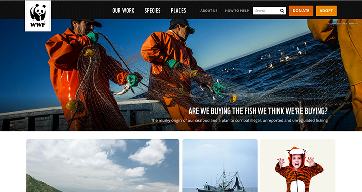
Desktop version.
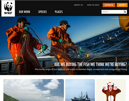
Tablet version.
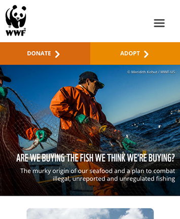
Mobile version.
Welcome to the world of responsive design. What differences do you notice?
Don’t fool yourself into thinking that all that’s happening is just a few things moving around and resizing. There’s actually a lot of strategic thinking behind what exactly happens with the content at the different screen sizes.
Notice how the Donate and Adopt buttons completely change size and prominence as the screen gets smaller? Why do you imagine that happens?
Responsive = Adaptive.
A few weeks ago, we wrote a blog post on the difference between personalized and adaptive learning. In that post we highlighted the importance of content. This post is about context. In order to make learning truly adaptive, not only must the learning platform use sophisticated algorithms to deliver the most relevant learning, it must also take into account how (on what device) the learning is being consumed.
Context has a big impact on engagement. Take a look at these facts about responsive design.
If your organization is currently losing the battle of engagement, I hope you can borrow an idea from the world of responsive design and give yourself an advantage in those five valuable minutes.