“Customers buy confidence. That confidence starts with the level of proficiency our frontline staff have in our products, services and tools.”
Mark Gil, Director of Learning & Development Frontline Training, AT&T
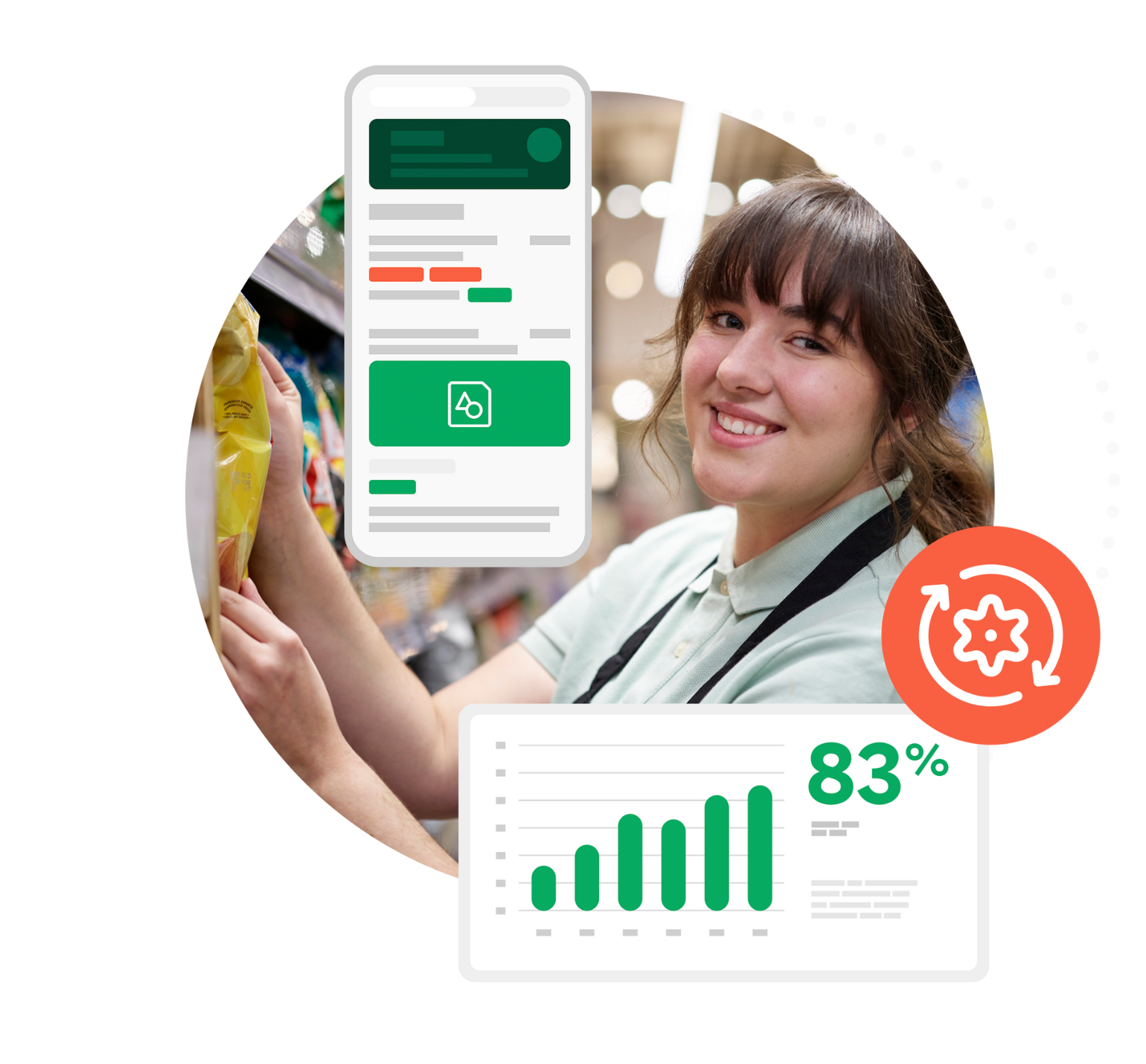
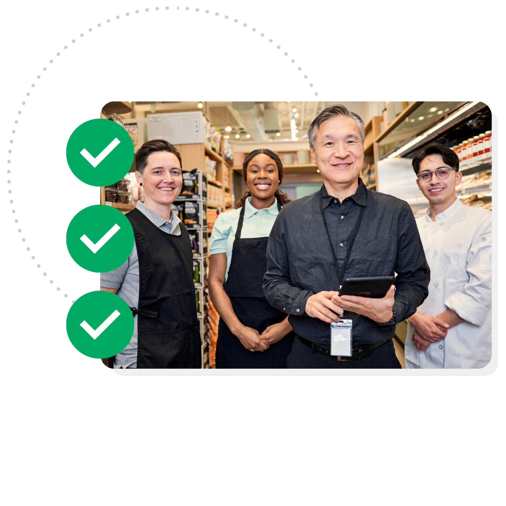
Consistent execution. Measurable results. Every location.
Every shift
Axonify integrates communication, training, and task management to ensure frontline teams are ready to deliver exceptional customer experiences every day.
Trusted by hundreds of businesses
and millions of frontline employees worldwide.
Operational excellence, redefined.
Axonify enables your frontline to bring your brand standards to life—turning company strategy into everyday actions.
Accelerate readiness
Get teams up to speed fast, push updates instantly, and keep them ready with the info they need at their fingertips.
Execute with consistency
Roll out new products and promotions flawlessly, with every location delivering exactly as planned.
Deliver exceptional experiences
Develop capable, confident frontline teams to create memorable moments and keep customers coming back.
Grow your business
Turn frontline execution into scalable performance, revenue growth, and rapid expansion into new markets.


Engineered to simplify frontline work
The Axonify frontline operations platform provides the essential tools your people need to execute consistently every shift.
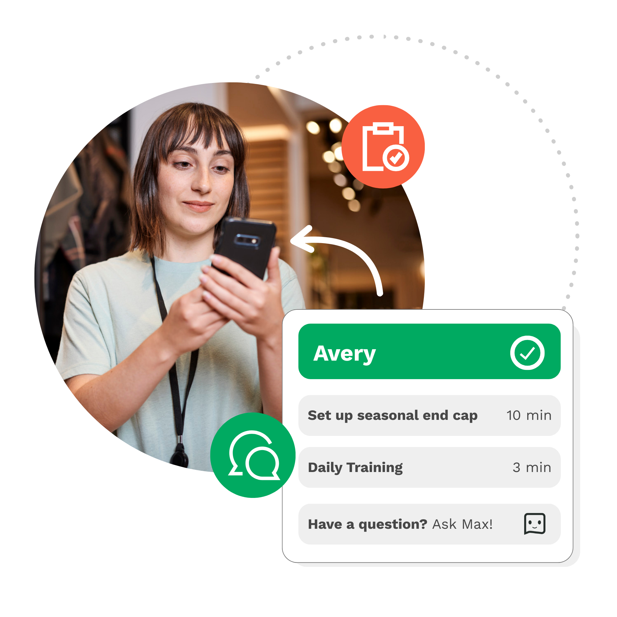
Frontline Teams
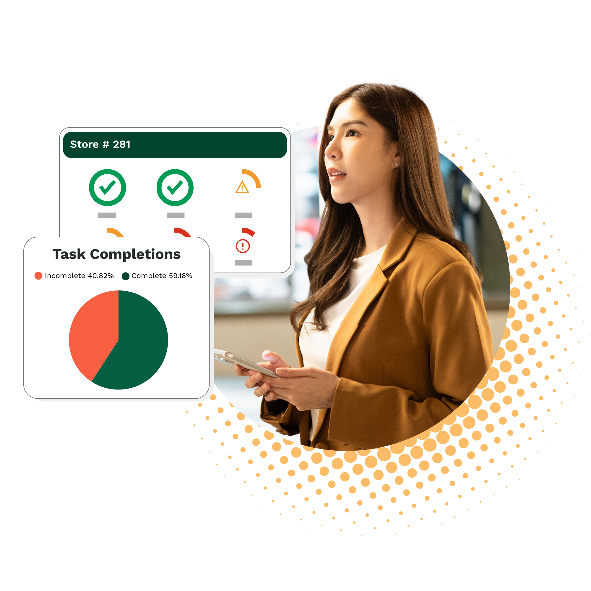
Location Managers
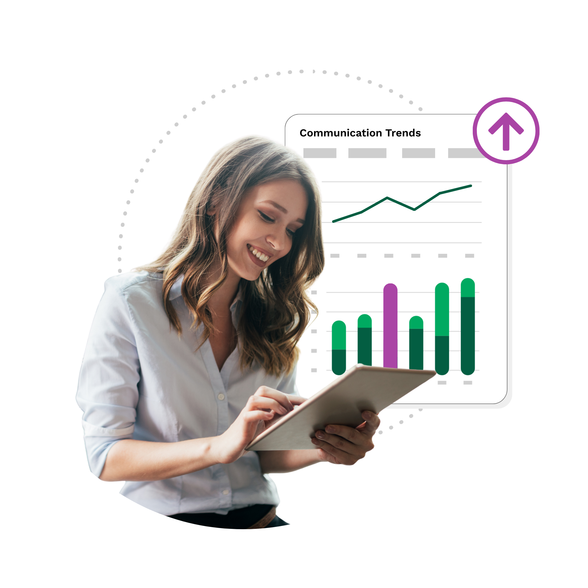
HQ Leadership
Support employees in the flow of work so they can deliver for your customers.
- Set daily priorities
Start every shift with a clear task list to keep work on track. - Push timely updates
Send messages directly to employee devices so they’re always in the know. - Bite size training
Reinforce critical knowledge and build new skills in minutes per day. - Guide execution
Introduce AI teammates that are always available to help out.
Equip managers with real-time insights to lead their teams and drive business results.
- Stay focused
Avoid complicated reports with data-driven nudges that highlight critical priorities. - Coach with confidence
Get a clear view of team member strengths and opportunities. - Build leadership skills
Fit development into busy schedules without disrupting the operation. - Run the business
Take charge of location training, tasks, and reporting without calling HQ.
Connect corporate to the frontline, ensuring plans are executed the right way in every location.
- Unify workflow
Replace scattered tools with one connected experience that keeps teams aligned. - Drive innovation
Capture on-the-ground insight to shape business improvements. - Boost ops intelligence
Analyze robust data from every location and adjust strategy on the fly. - Automate admin
Use AI to generate content, automate processes, and personalize training.
“Our associates love Axonify. We’re always searching for solutions to simplify and streamline the experience for our associates and this has been a really great partnership.”
Senchal Murphy, Senior Director, Human Resources and Talent Development, Kroger
Breakthrough performance. Unmatched results.
Axonify helps frontline teams ramp faster, stay aligned, and work more effectively every day. This drives a range of business outcomes, including increased sales and productivity, reduced shrink and safety incidents, improved customer satisfaction, and reduced turnover.
127%
increase in sales KPI performance
20%
boost in frontline productivity
76%
reduction in labor hours spent on training